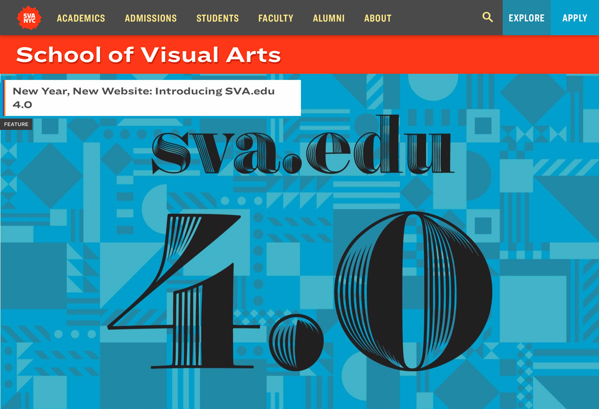
SVA Redesign
Check out the SVA Feature story or Steve Heller's PRINT Magazine article about the project.
Technologies:
HTML5
CSS3
Sass
Nuxt
Node
Vue
Symfony
Gitlab
Sketch
Framer
Zeplin
To boldly refresh the public face of one of NYC's leading art education institutions.
Our tiny team designed and prototyped every template and detail of the site, both for the public-facing front end, and the custom, built-from-scratch CMS, which the SVA community uses to craft high-quality content.
We accomplished a 30% content reduction over the previous version of sva.edu., thanks to our content strategy (developed in partnership with Karen McGrane and Ethan Marcotte), extensive prototyping using a fully interactive, coded site, testing, and many meetings.
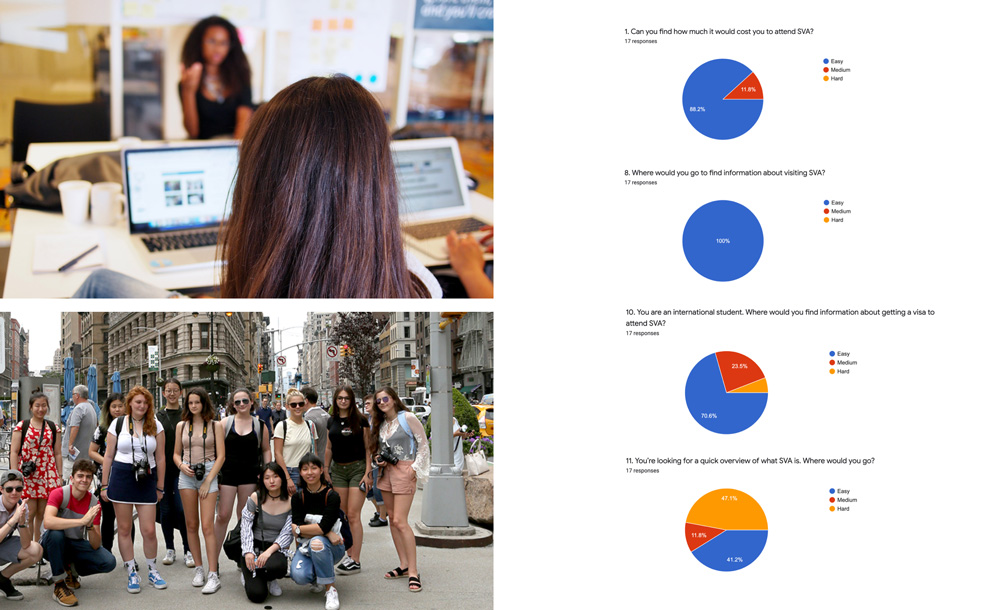
One of the great perks of working for an art school is that we have many (mostly) willing user testing subjects in classes across the street. We conducted multiple usability tests with our target demographic: Pre-College and Freshman students, which provided invaluable data for design revisions.
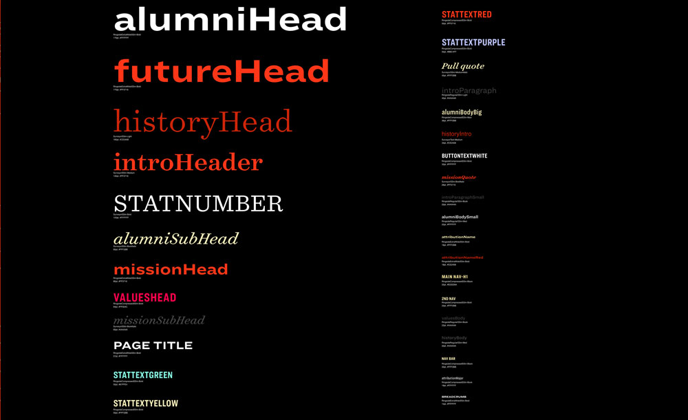
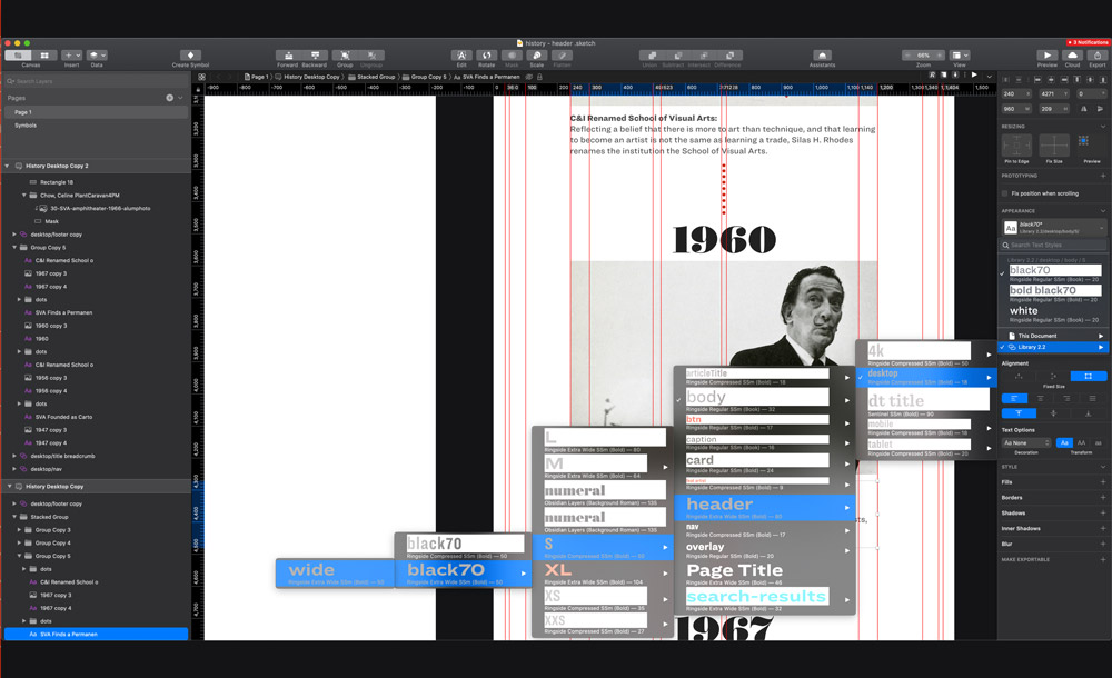
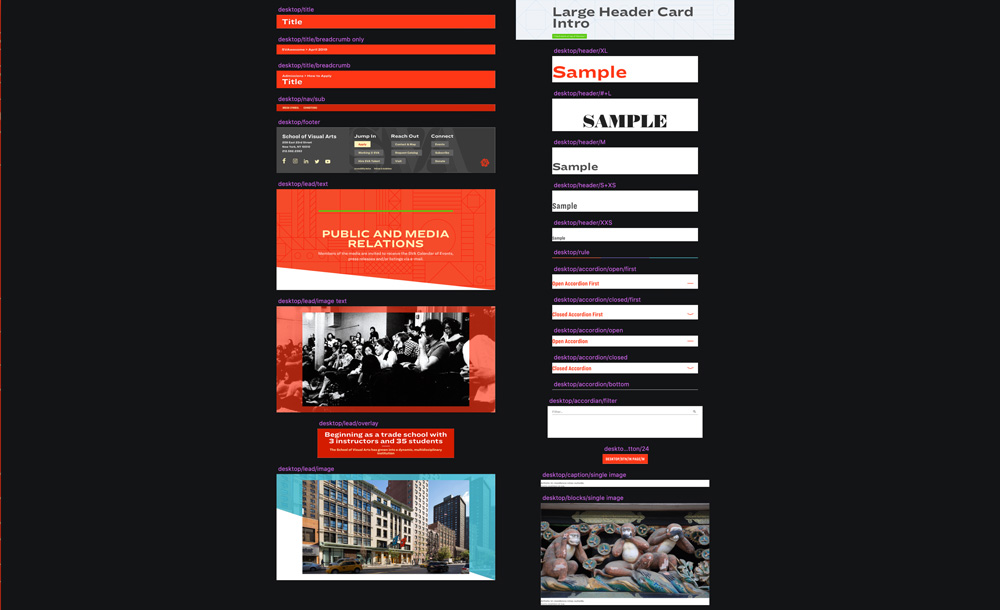
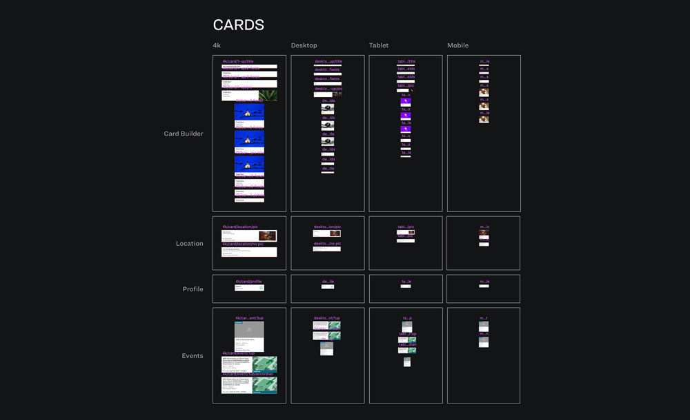
I played a central role developing our design system and workflow. We built an organized system based on a central, shared Sketch library full of nested symbols and namespaced text styles so we designers could efficiently build new page designs.
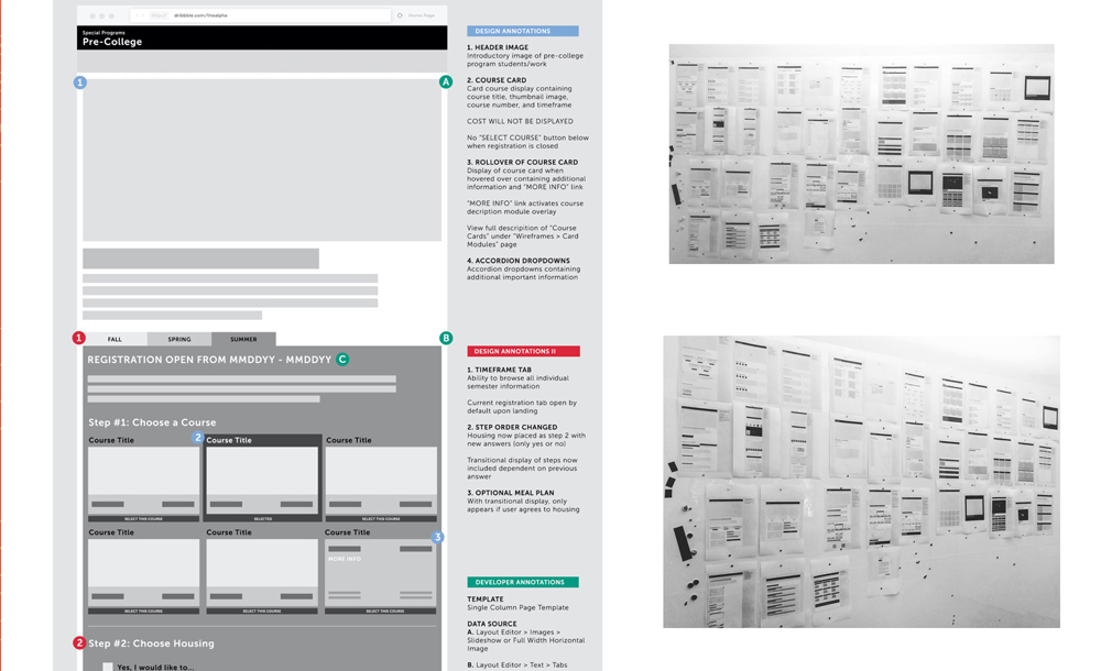
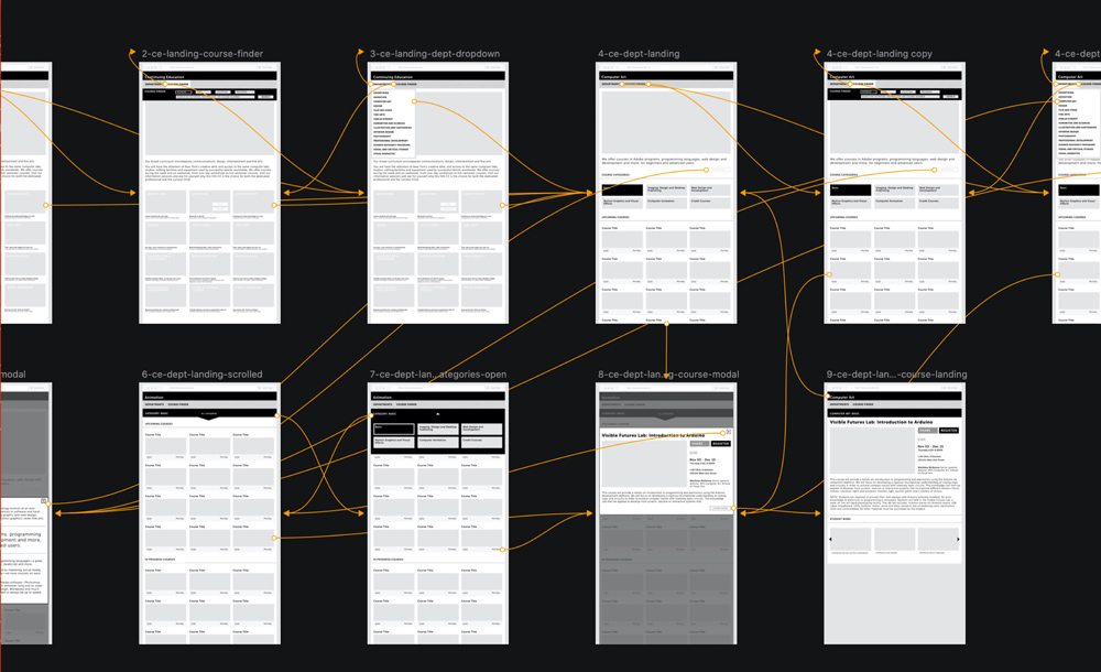
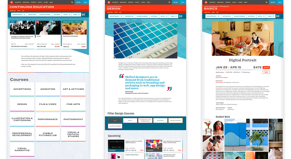
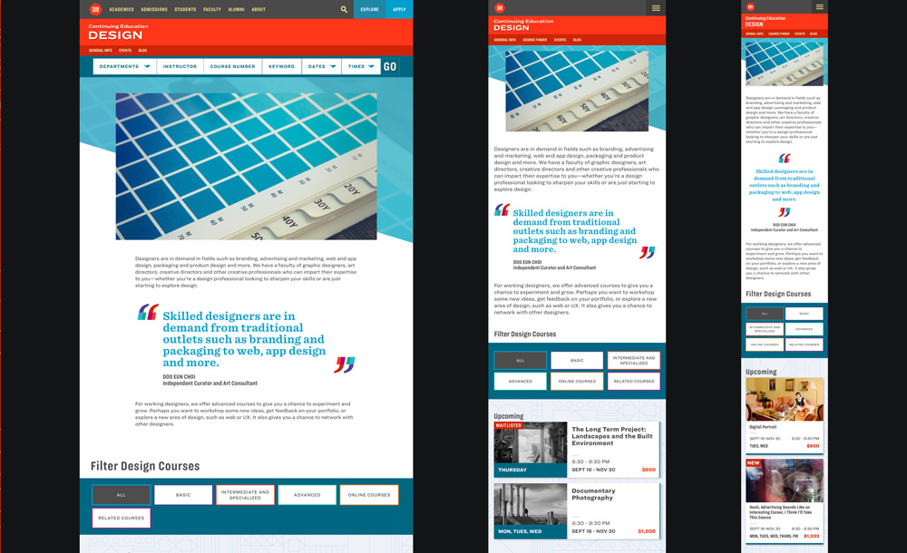
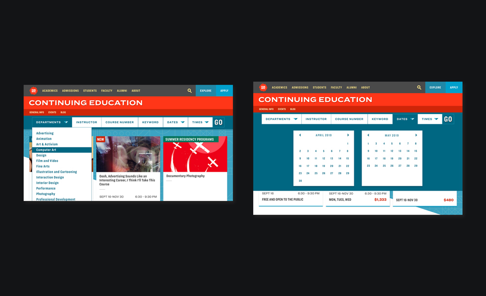
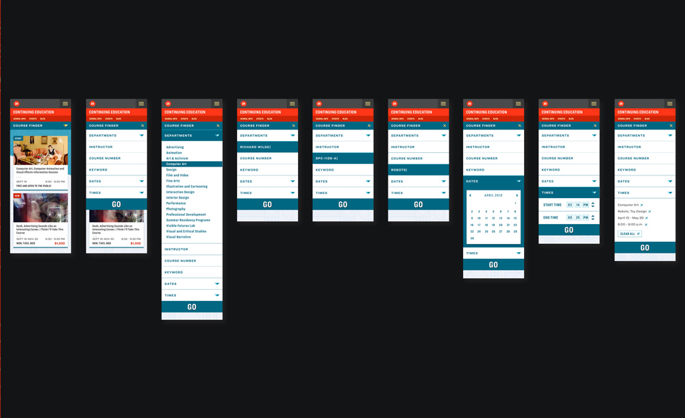
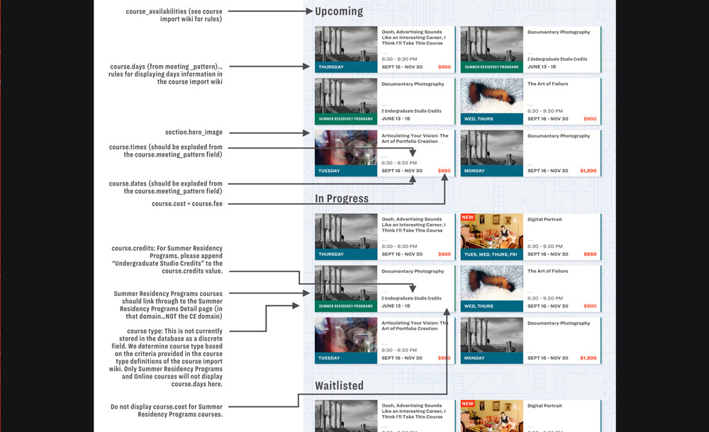
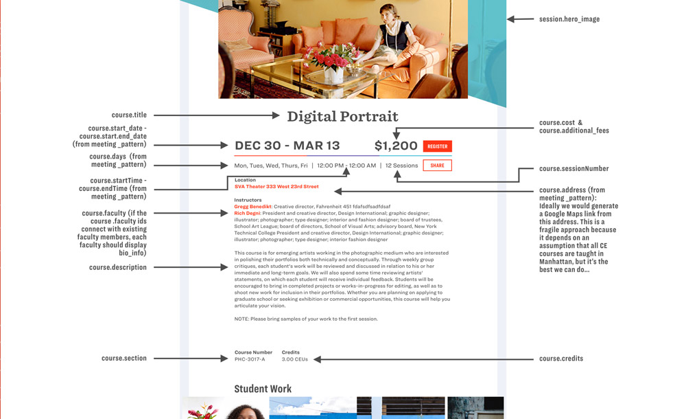
The design process was a huge team effort, but I crafted user flows, wire-frames, prototypes, and finished designs for the most complex, registration-oriented sections, like Continuing Education, Pre-College, Summer Housing, and the Destinations programs.
We developed an efficient workflow that nevertheless required comprehensive documentation on my part (especially as a designer and developer), to close the gap between design and development.
We designed the site using humble tools like pencil and gridded paper as well as complex Sketch libraries, user flows, Principle, Framer, InVision, and Sketch prototypes, and animation tests like the one above.
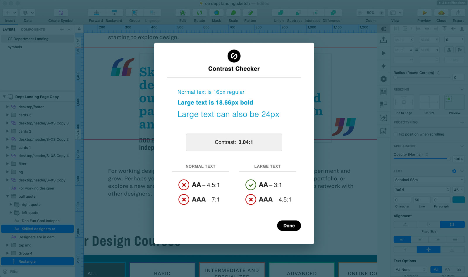
We designed and developed a site accessible to all. We used plugins in Sketch to check color contrast as we designed, and consulted experts to ensure our implementations are fully accessible for screen-reader users.